BACKGROUND
Customer Base
7,000
Eye Care Practices
Customer Types
Single and multi-location
Eye Care Practices
User Types
4
User roles
PROBLEM
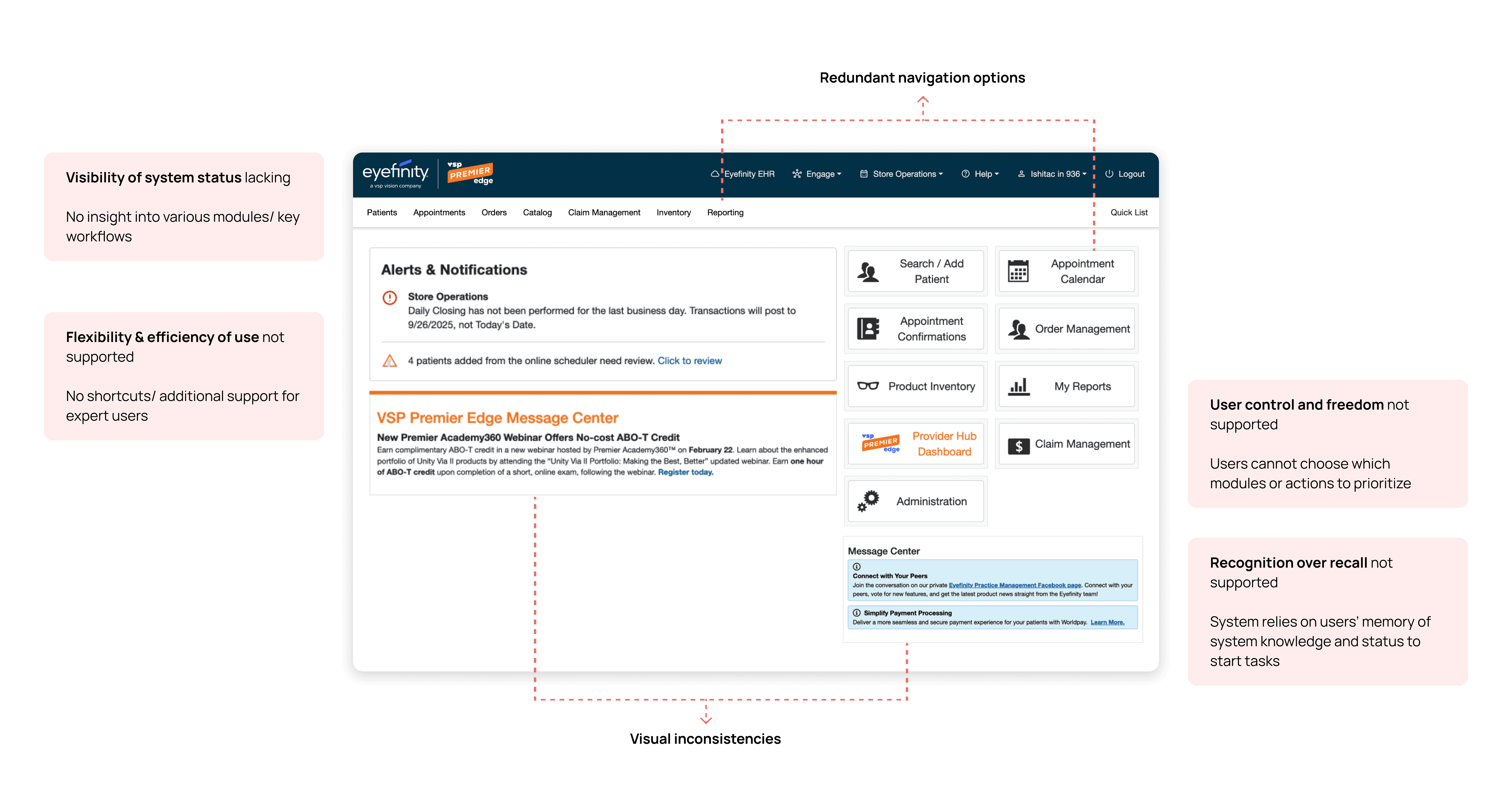
Complex workflows requiring too many clicks for completing simple tasks
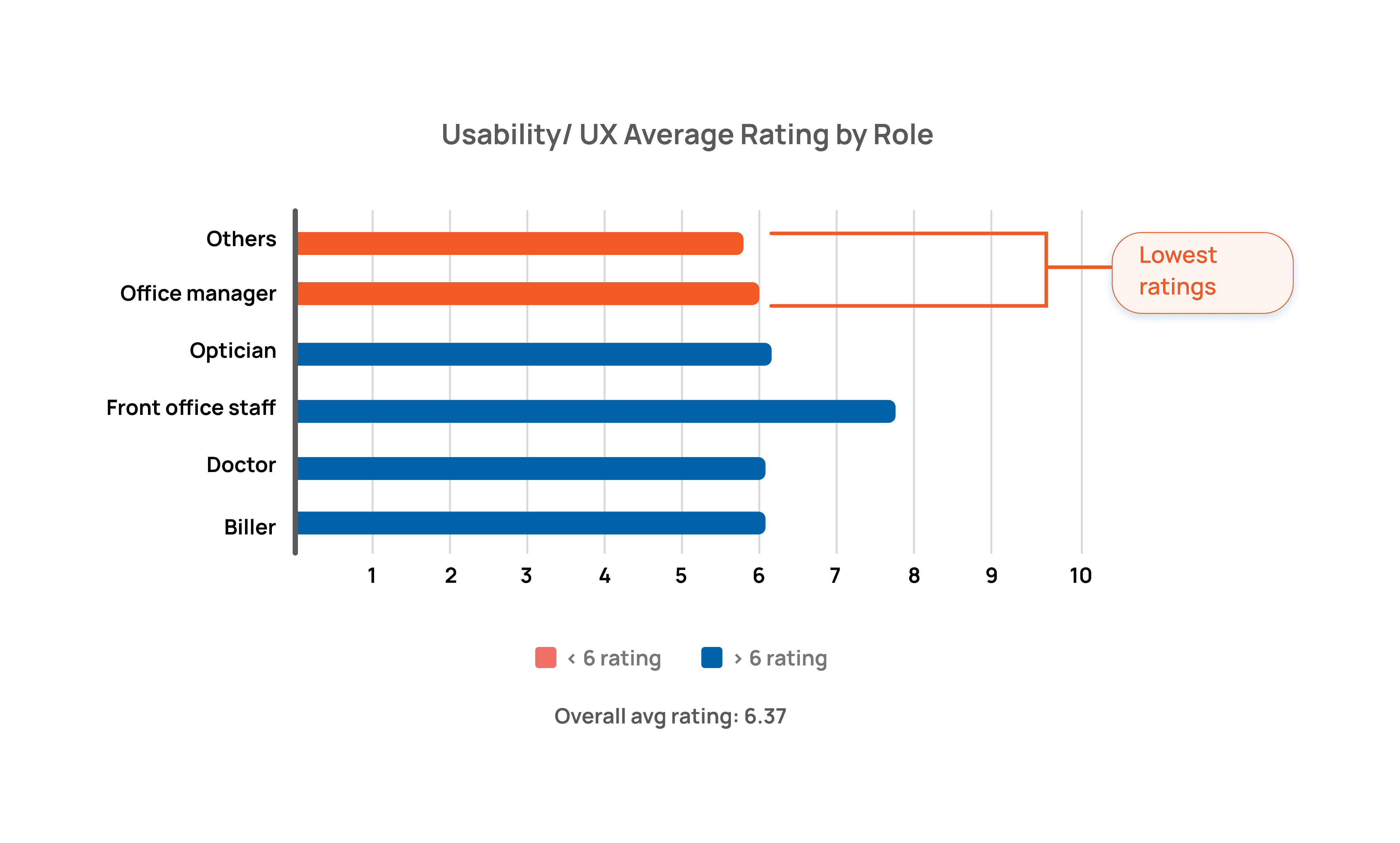
With an NPS that was 40 points lower than the industry average, Encompass was noted to have several usability and efficiency issues for clinics.
10 clicks, one dead end, 20-30 times a day
The platform's dashboard relies on users’ recognition of tasks and understanding of which tasks to prioritize
An initial heuristic evaluation revealed key issues with system visibility due to lack of real-time information regarding practice health and a standard template of navigation links which are not contextually prioritized based on various user roles' needs.
DESIGN BRIEF
Dashboard Redesign Scope
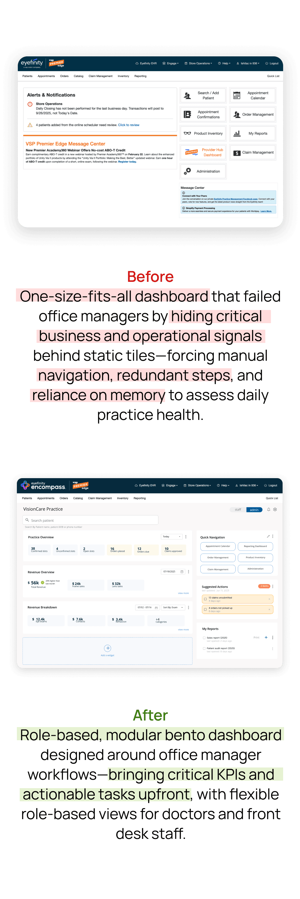
I redesigned the the software’s dashboard to maximize efficiency, helping each user role reach their target workflows easily as well as take informed decisions and actions based on the clinic’s real-time situation. The dashboard is the first screen every user sees every single day — it was the highest-leverage intervention point in the entire product.
Redesign Goals

Reduce redundancy

Support role diversity

Surface business health upfront
Through discussions with PM’s about practice priorities and previous discovery efforts, I focused on the front desk and office manager views as being the north star vision driving the dashboard conceptualization. These roles expressed the highest dissatisfaction with platform usability.
FEATURE 1
Custom layout dashboard to support real-time task prioritization and cutting down steps to access patient information
This modular layout concept I designed includes one main customizable widget, which is one high-priority workflow surfaced per role which can be switched, alongside real-time practice metrics and other static widgets. The goal was to answer the question every user has when they log in: what do I need to do right now?
Process
The service blueprint revealed every action pointed downward: this pointed to users always digging for information while nothing is surfaced preemptively.
I created a service blueprint which captured main actions, user interactions with the software and backend flow of information. This revealed that all Encompass workflows revolve around three patient visit phases - pre-visit, during visit and after visit.


Although practice needs may differ based on business size and operations, appointment scheduling and user coordination during patient visits play a key role in supporting business operations and driving value for patients.
Should the dashboard prioritize flexibility for all users, or provide tailored action points for each role?
To support the office manager role as well as users who may work across workflows in practices like independent practices, the goal was to provide flexibility yet maintain efficiency through the new dashboard design. Our service blueprint revealed overlapping workflows but vastly different priorities across user roles. This divergence shaped the core ideation challenge…
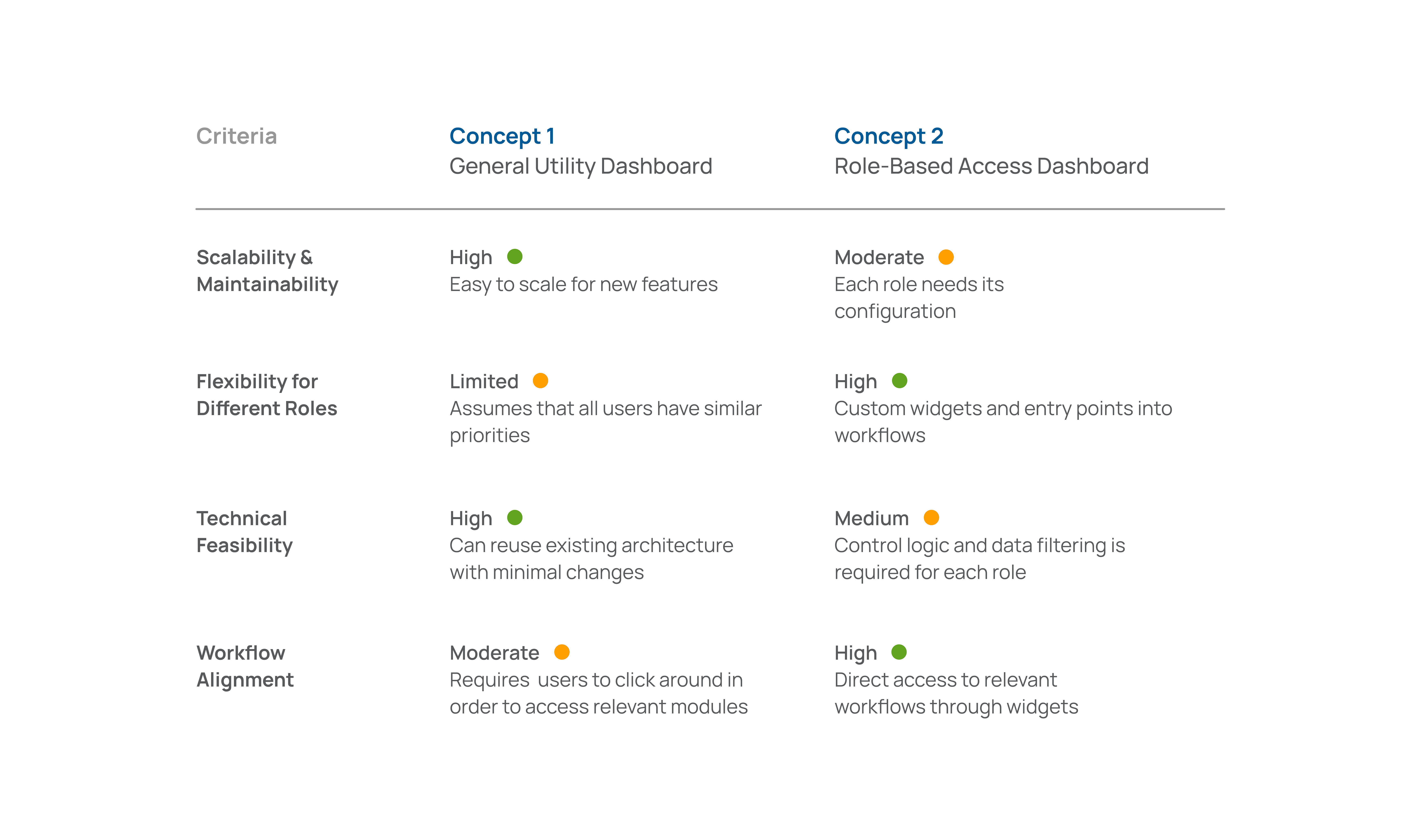
Choosing the role-based access view would provide custom action points at the cost of overall visibility while a generic view would provide flexibility at the cost of customization
FEATURE 2
Patient readiness view within the landing page for front desk staff
Front desk staff search for the same patient information up to 40-50 times a day across multiple modules. That redundancy was their biggest pain point. To negate this, I introduced a patient readiness view which displays upcoming appointment and subsequent patient information to help front desk staff manage communication, intake form status updates and patient traffic.

Process
Front desk staff were pulling patient info about form status, test results, all manually retrieved every time. This was causing inefficiency and redundancy in tasks.
To ensure my design includes the highest leverage workflow entry points, I included patient and corresponding appointment information with quick links within the front desk staff's main widget.

Front desk staff journey map
FEATURE 3
Admin view with salient KPI’s and report saving options
The same hybrid architecture serves a completely different user need for office managers; instead of patient management, this focuses on helping users track business performance. Detailed visualizations of business performance metrics to help managers monitor salient information such as revenue breakdown based on categories such as product or exam type
Enabling report downloads and saving for reference
List of pinned reports generated by the manager for future reference in order to support administrative tasks and practice operations' planning
Process
Office managers were navigating 3-4 separate modules just to understand how their practice performed that week. Surfacing key KPI's to serve as key parameters gives them a quick snapshot of business health.
Tracking various business metrics across different practices, time periods and factors can be quite frustrating when the user is required to customize each parameter to generate a specific report from scratch.
Detailed visualizations of business performance metrics to help managers monitor salient information such as revenue breakdown based on categories such as product or exam type.

TESTING
Online moderated usability test sessions were conducted with practice managers working at small business practices as well as multi-location eyecare practices. The goal was to test alignment of widget functionality and layout approach with the needs of office managers to support their day-to-day tasks.
Test Plan
Sample
7
Participants
Average session duration
35
Minutes
Task range
4
Tasks
Iterations created to reduce cognitive load through progressive disclosure of business health information as well as retaining quick navigation links
The test sessions conducted with office managers resulted in positive feedback from them about the ease of viewing real-time practice information as well as the ability to use a custom layout to support daily monitoring of KPI's as per each practice's needs. However, 80% of participants indicated that the initial iteration was cluttered and slightly overwhelming to view right after logging in to the platform.
Thus, refinements were made to the data visualization elements within the UI and the progressive disclosure principle was used to surface only numeric values initially, with the complete data charts being displayed only once the user clicks 'view more'.
User quotes
“This page is a neat little snapshot of the practice — exceptional”

Office Manager,
small business
"It's definitely more supportive than the landing page we currently have"
Office Manager,
small business
“This would save our practice 3-4 hours every week in managing appointments”

Doctor,
enterprise business
IMPACT
Reduced Task
Time
Pulling reports to monitor practice metrics
36%
Reduction in task time
Scheduling appointments and managing patient flow
40%
Reduction in key workflows
Improved Navigation
Dashboard experience optimized
4/5
Rating indicating improved navigation
Doctor and staff workflows
29%
Increase in navigational clarity in finding salient patient info